nlmixr2 augmented plot
By Matthew Fidler in nlmixr2
March 31, 2025
This month I will on a single nlmixr2’s plot function that is shared
with nlme, augPred(). I think this is useful but also harder to
find like the rxode2 plots discussed last month.
The example of this feature is the phenobarbitol data:
library(nlmixr2)
pheno <- function() {
  ini({
    tcl <- log(0.008) # typical value of clearance
    tv <-  log(0.6)   # typical value of volume
    ## var(eta.cl)
    eta.cl + eta.v ~ c(1,
                       0.01, 1) ## cov(eta.cl, eta.v), var(eta.v)
                      # interindividual variability on clearance and volume
    add.err <- 0.1    # residual variability
  })
  model({
    cl <- exp(tcl + eta.cl) # individual value of clearance
    v <- exp(tv + eta.v)    # individual value of volume
    ke <- cl / v            # elimination rate constant
    d/dt(A1) = - ke * A1    # model differential equation
    cp = A1 / v             # concentration in plasma
    cp ~ add(add.err)       # define error model
  })
}

# Note the suppress messages simply removes the output from the
# fit so it is easier to read in the blog.
fit <- suppressMessages(nlmixr(pheno, pheno_sd, "saem",
                               control=list(print=0),
                               table=list(cwres=TRUE, npde=TRUE)))
You can see the basic plots including the individual plots:
p <- plot(fit)

# Here I am subsetting the plots to show only individual plots
p <- p[["All Data"]]

# In this case the list of plots is named starting with "individual"
w <- which(vapply(names(p), function(x) grepl("individual", x), logical(1)))

# This creates a new list of plots, and changes it to the same class
# as output by nlmixr2
p <- lapply(w,function(x) p[[x]])
class(p) <- "nlmixr2PlotList"


#This is a hack to suppress the warnings & messages from the plot function
suppressMessages(suppressWarnings(print(p)))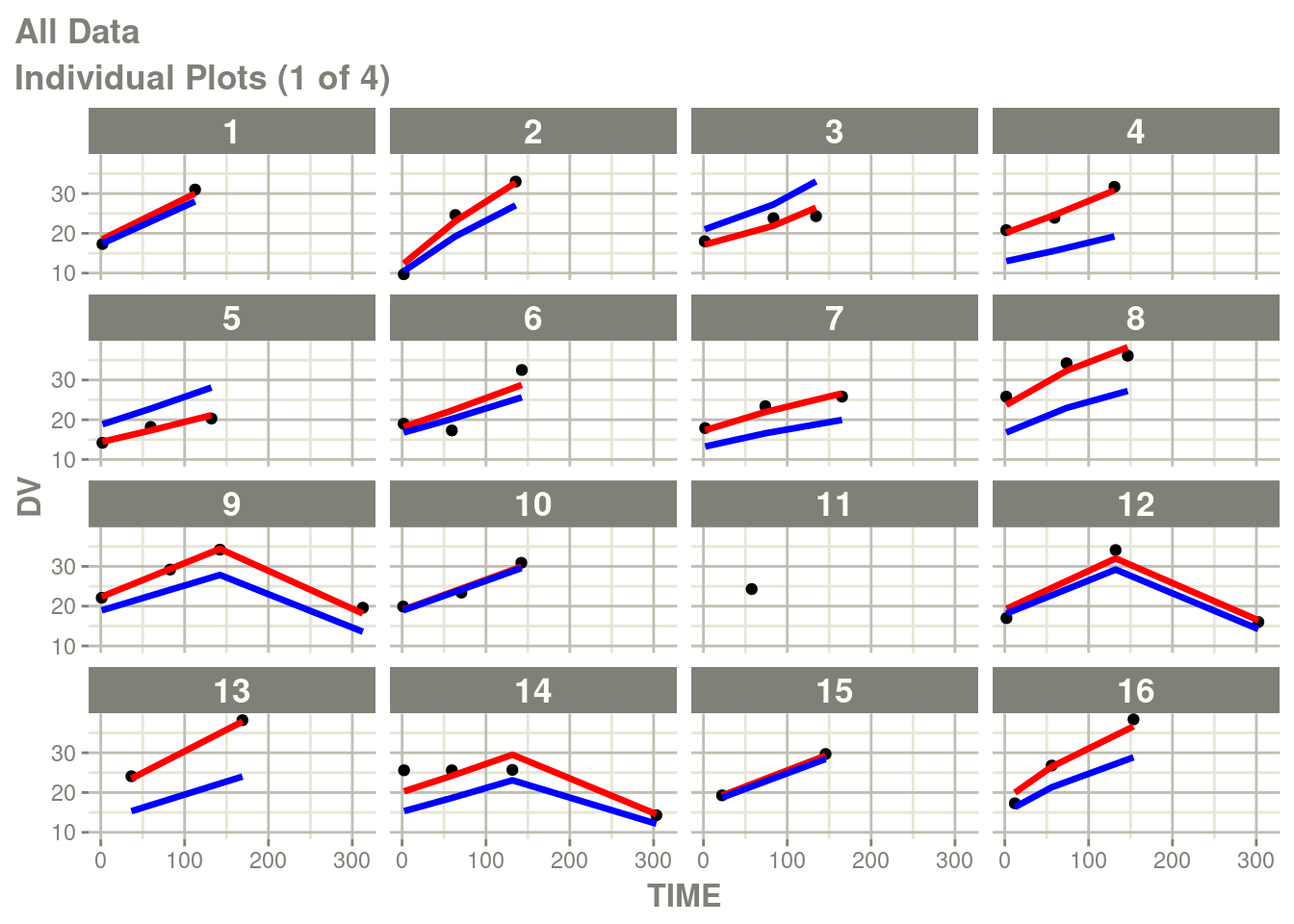
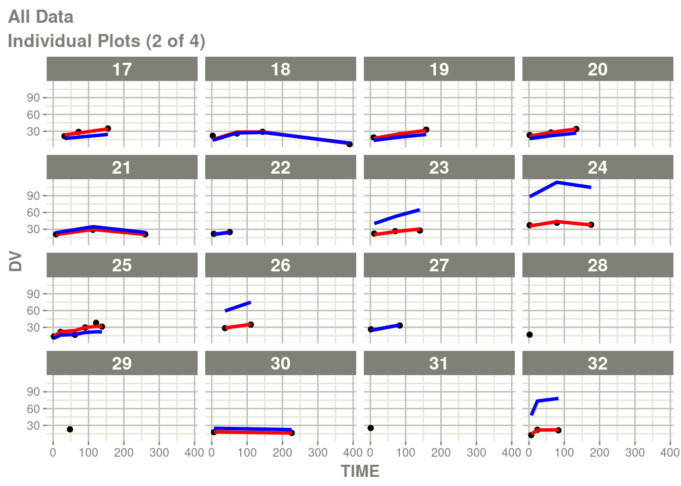
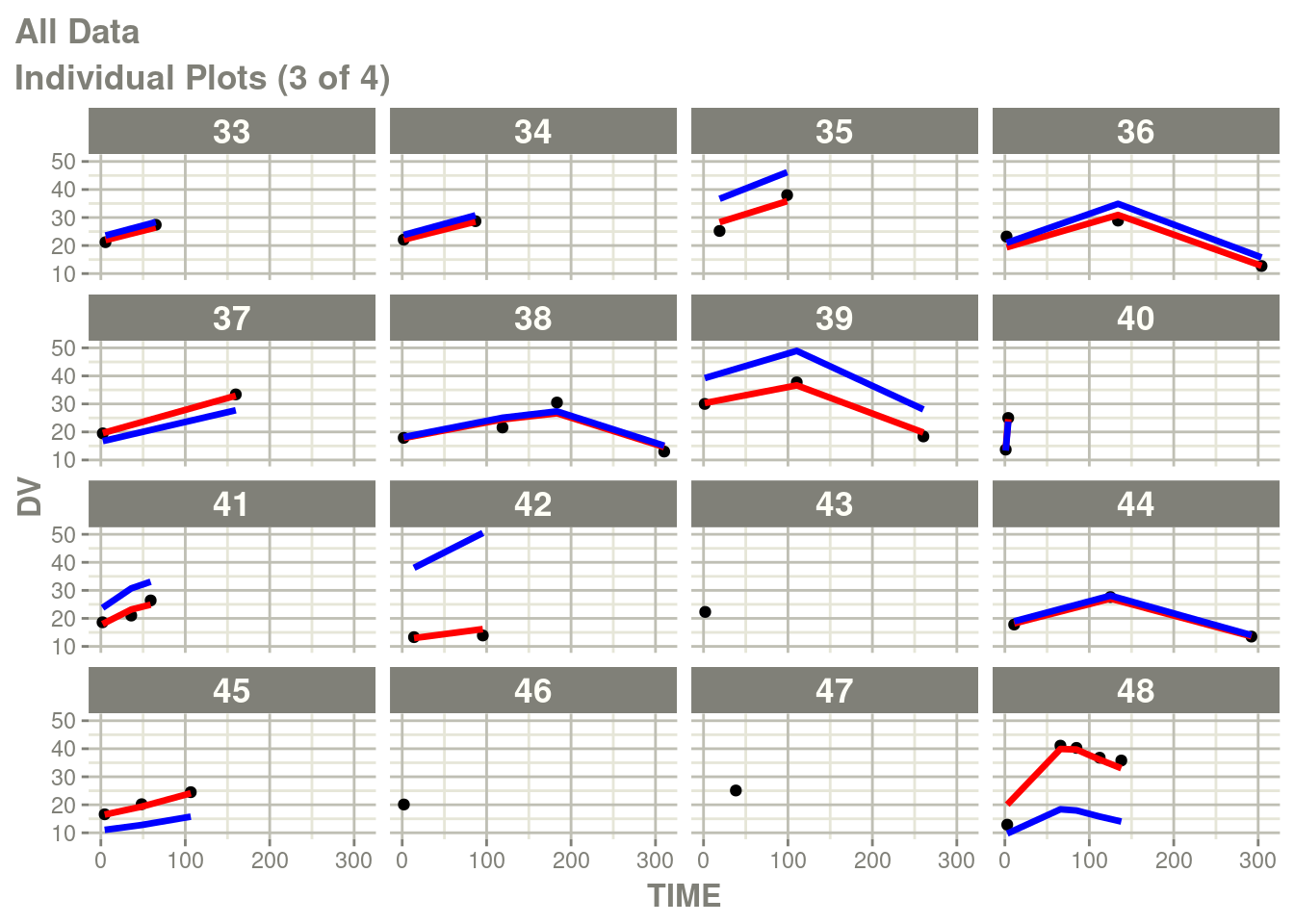
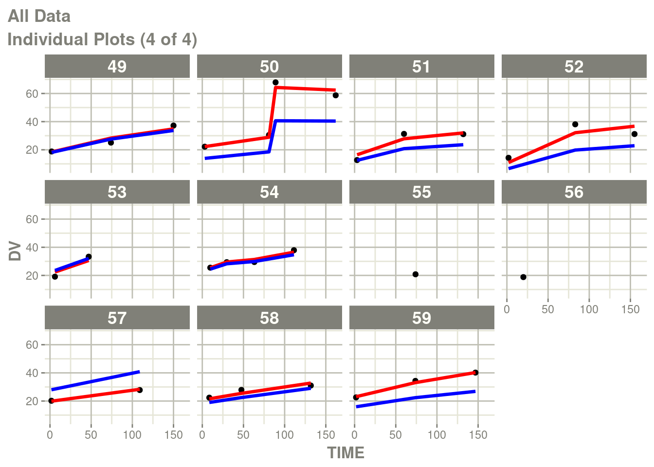
In particular the individual plots does not show the complete prediction.
One way to get the complete prediction is to add more points to the
rxode2 prediction than what is in the original dataset.
In NONMEM (and in nlmixr2) you can add EVID=2 predictions
into your input dataset, though the ODE solving mesh may change your
nlme solution.
Another method is to add the observations after the nlme fit is
complete by using augPred()
This is simple:
ap <- augPred(fit)

head(ap)
## values ind id time Endpoint
## 1 18.71656 Individual 1 0.000 A1
## 2 18.54663 Individual 1 2.000 A1
## 3 18.06285 Individual 1 7.796 A1
## 4 20.01561 Individual 1 15.592 A1
## 5 19.31653 Individual 1 23.388 A1
## 6 21.18352 Individual 1 31.184 A1You can see this is a dataset that you can plot yourself with any
package you would like. Like rxode2 there is a ggplot2 method
attached to plot for augPred() datasets from nlmixr2:
# The suppressWarnings, supress messages and print is made
# to abbreviate the output, you can also simply use plot(ap)
suppressWarnings(suppressMessages(print(plot(ap))))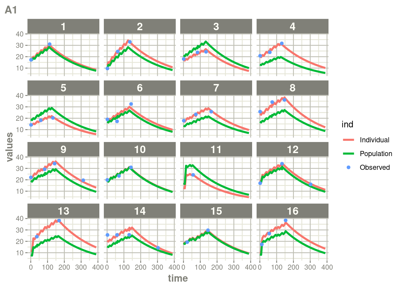
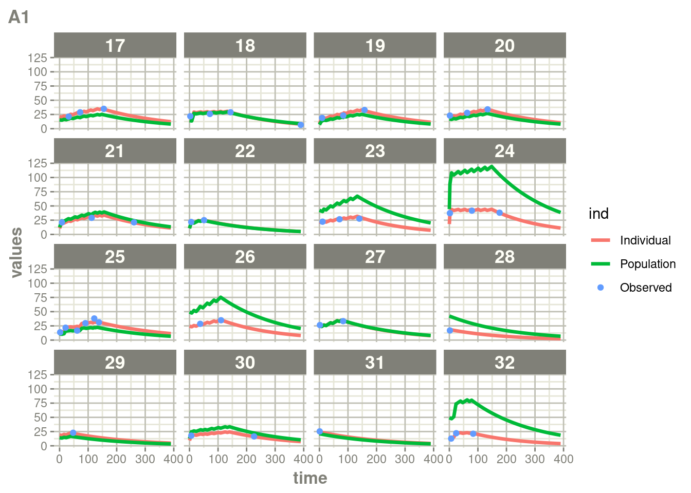
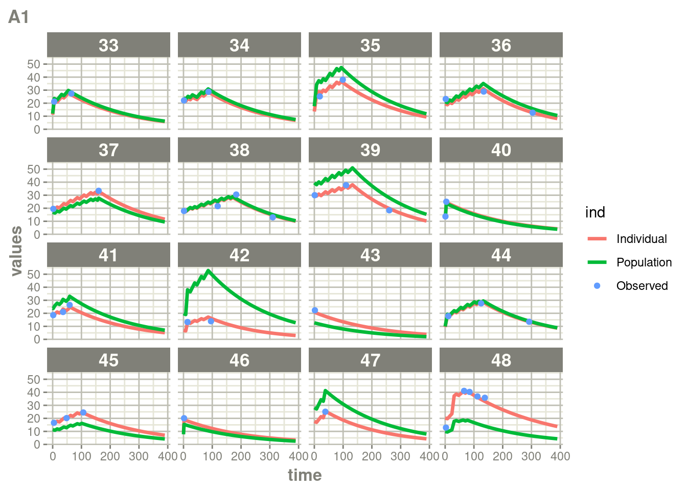
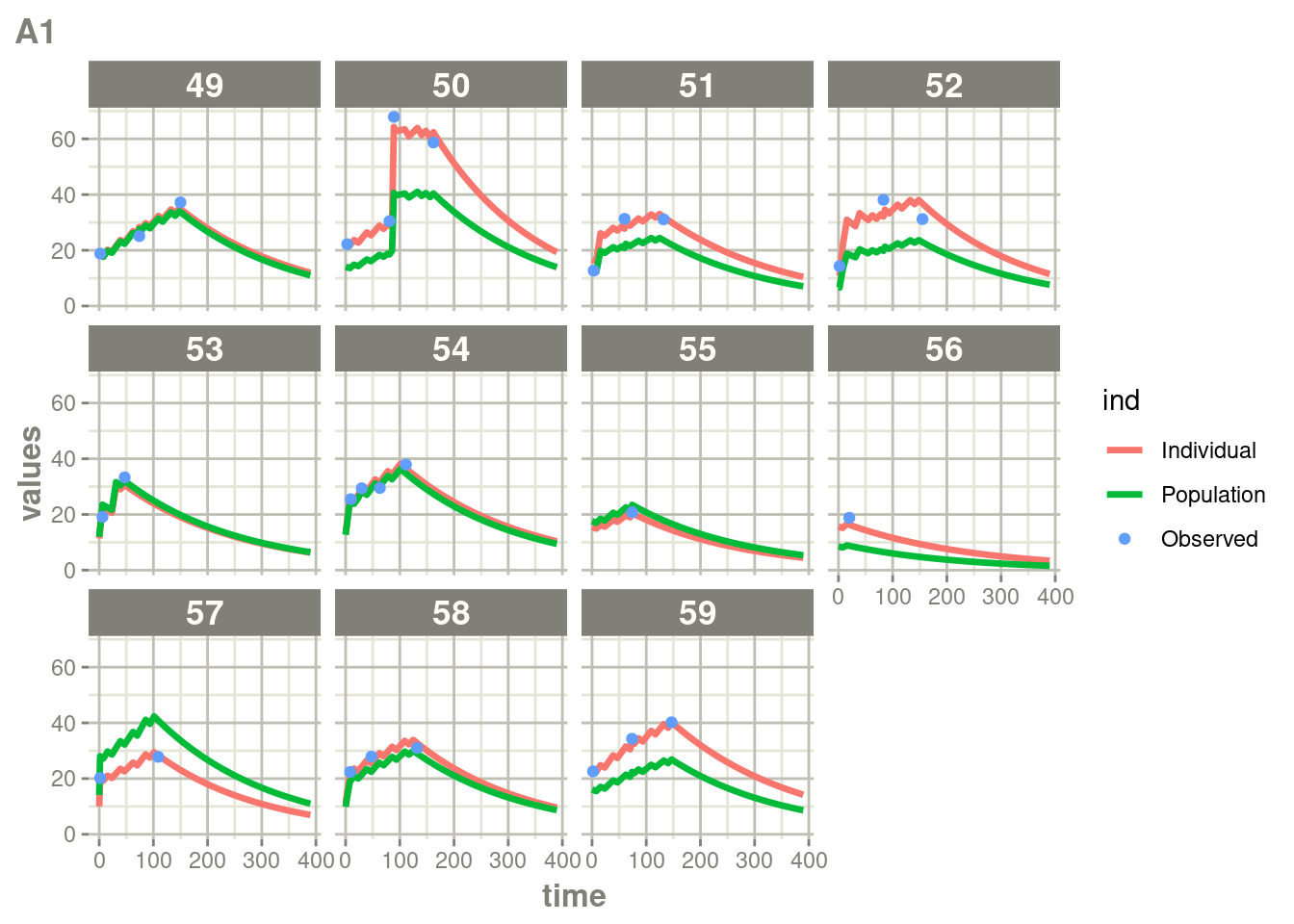
Here you see the affect of dosing on the outcome more clearly than the traditional individual predictions.
This also works with multiple endpoint models:
pk.turnover.emax3 <- function() {
  ini({
    tktr <- log(1)
    tka <- log(1)
    tcl <- log(0.1)
    tv <- log(10)
    ##
    eta.ktr ~ 1
    eta.ka ~ 1
    eta.cl ~ 2
    eta.v ~ 1
    prop.err <- 0.1
    pkadd.err <- 0.1
    ##
    temax <- logit(0.8)
    tec50 <- log(0.5)
    tkout <- log(0.05)
    te0 <- log(100)
    ##
    eta.emax ~ .5
    eta.ec50  ~ .5
    eta.kout ~ .5
    eta.e0 ~ .5
    ##
    pdadd.err <- 10
  })
  model({
    ktr <- exp(tktr + eta.ktr)
    ka <- exp(tka + eta.ka)
    cl <- exp(tcl + eta.cl)
    v <- exp(tv + eta.v)
    emax = expit(temax+eta.emax)
    ec50 =  exp(tec50 + eta.ec50)
    kout = exp(tkout + eta.kout)
    e0 = exp(te0 + eta.e0)
    ##
    DCP = center/v
    PD=1-emax*DCP/(ec50+DCP)
    ##
    effect(0) = e0
    kin = e0*kout
    ##
    d/dt(depot) = -ktr * depot
    d/dt(gut) =  ktr * depot -ka * gut
    d/dt(center) =  ka * gut - cl / v * center
    d/dt(effect) = kin*PD -kout*effect
    ##
    cp = center / v
    cp ~ prop(prop.err) + add(pkadd.err)
    effect ~ add(pdadd.err) | pca
  })
}

# Like the prior model, we wish to suppress messages too:
fit.TOS <- suppressMessages(nlmixr(pk.turnover.emax3, warfarin, "saem", control=list(print=0),
                                   table=list(cwres=TRUE, npde=TRUE)))
Just like you can see the individuals from the standard plot:
p <- plot(fit.TOS)

# Here I am subsetting the plots to show only individual plots
cp <- p[["Endpoint:  cp"]]
pca <- p[["Endpoint:  pca"]]

# In this case the list of plots is named starting with "individual"
w <- which(vapply(names(cp), function(x) grepl("individual", x), logical(1)))

# This creates a new list of plots, and changes it to the same class
# as output by nlmixr2
cp <- lapply(w,function(x) cp[[x]])
class(cp) <- "nlmixr2PlotList"


# In this case the list of plots is named starting with "individual"
w <- which(vapply(names(pca), function(x) grepl("individual", x), logical(1)))

# This creates a new list of plots, and changes it to the same class
# as output by nlmixr2
pca <- lapply(w, function(x) pca[[x]])
class(pca) <- "nlmixr2PlotList"


#This is a hack to suppress the warnings & messages from the plot function
suppressMessages(suppressWarnings(print(cp)))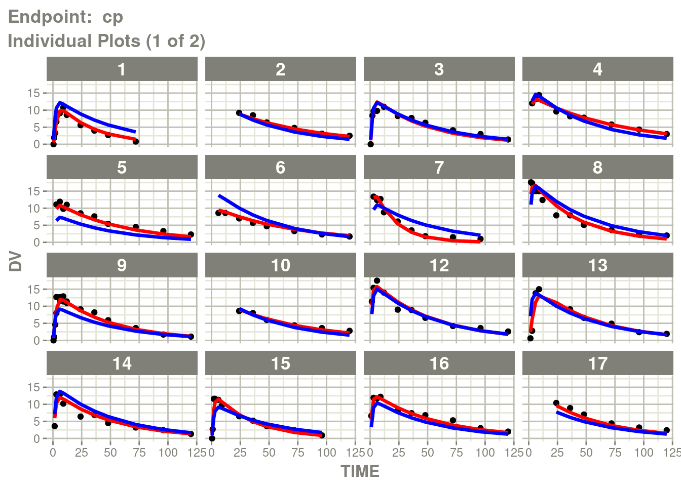
suppressMessages(suppressWarnings(print(pca)))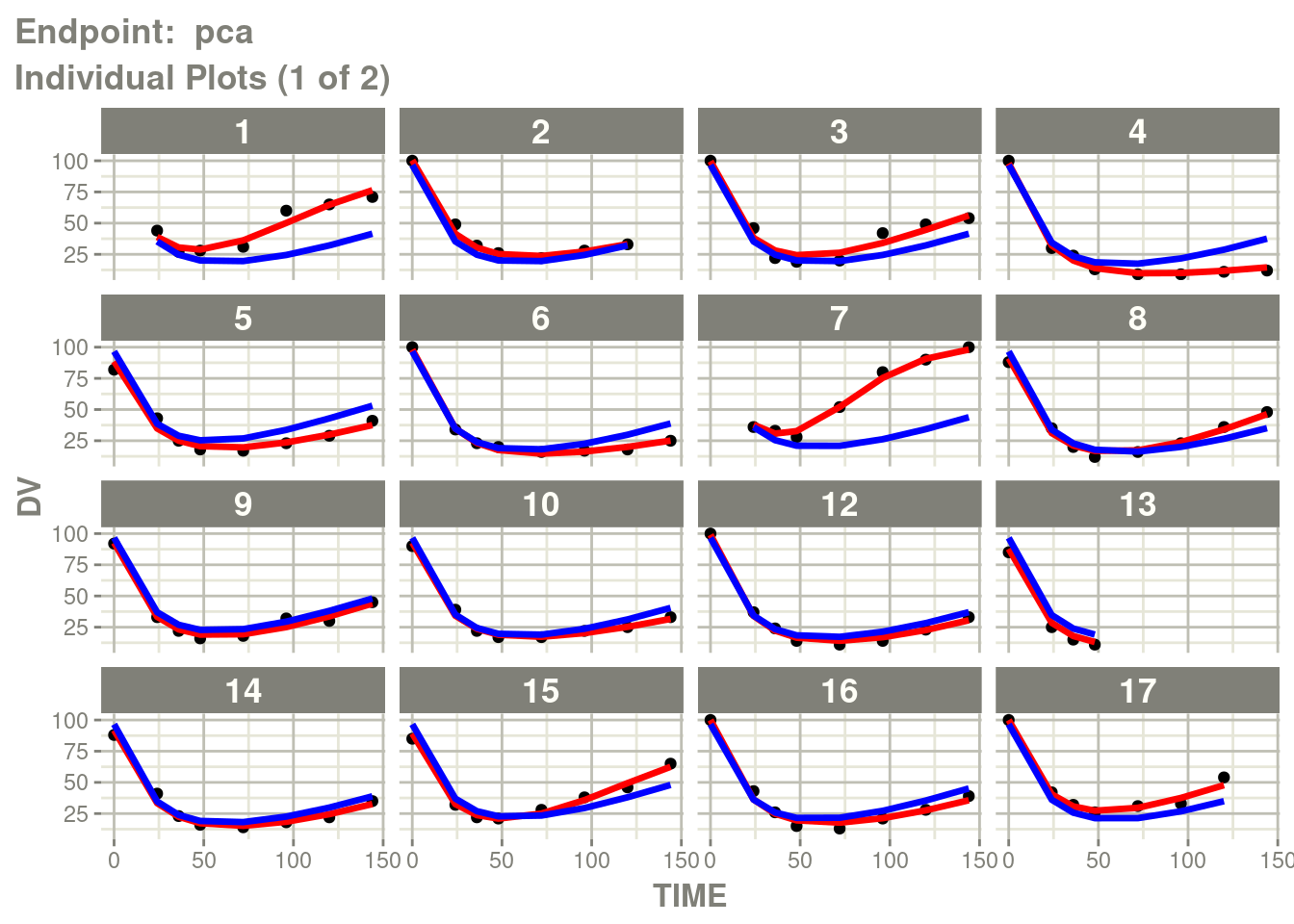
Now you see the augmented predictions separated by endpoint:
suppressWarnings(suppressMessages(plot(augPred(fit.TOS))))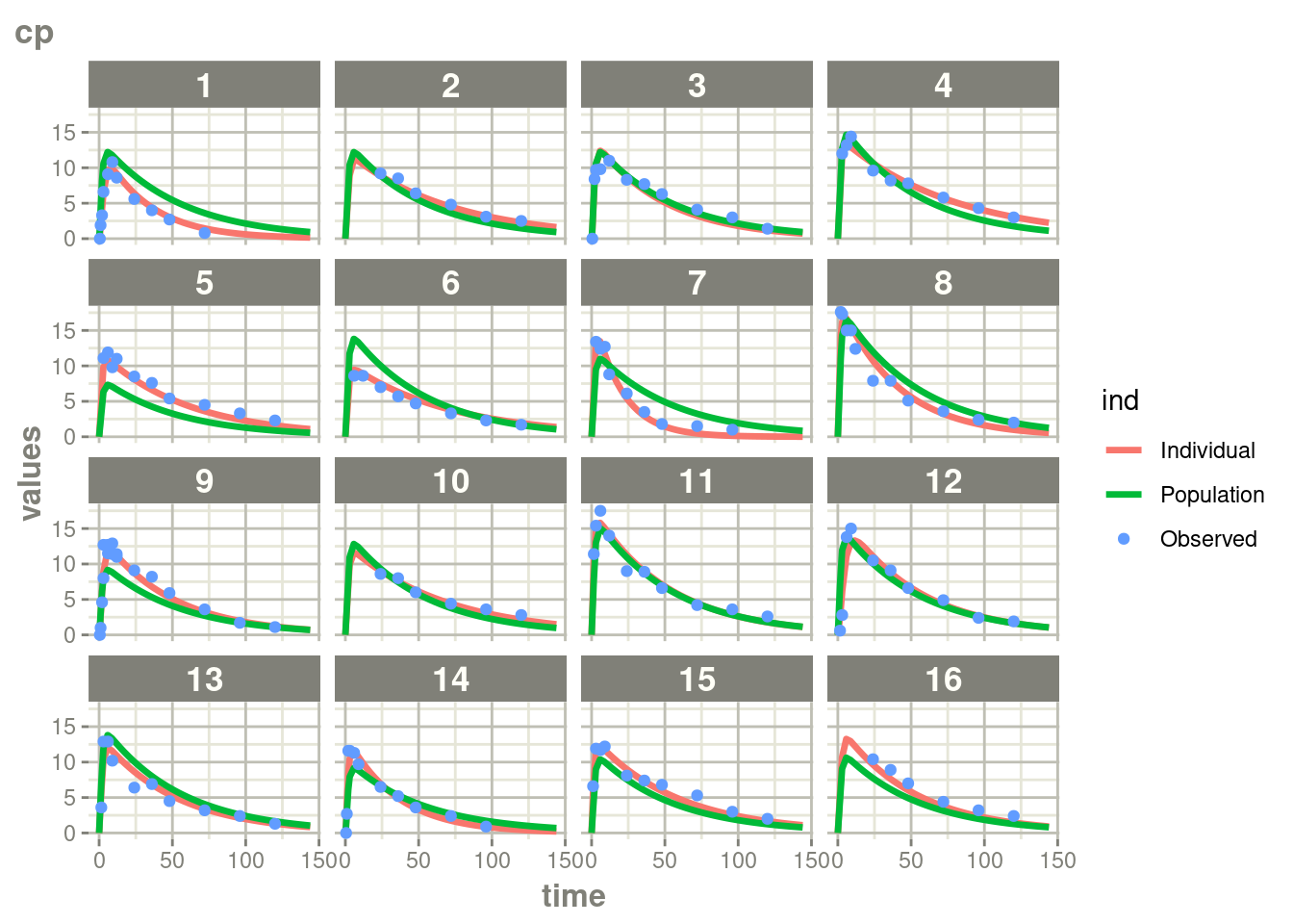
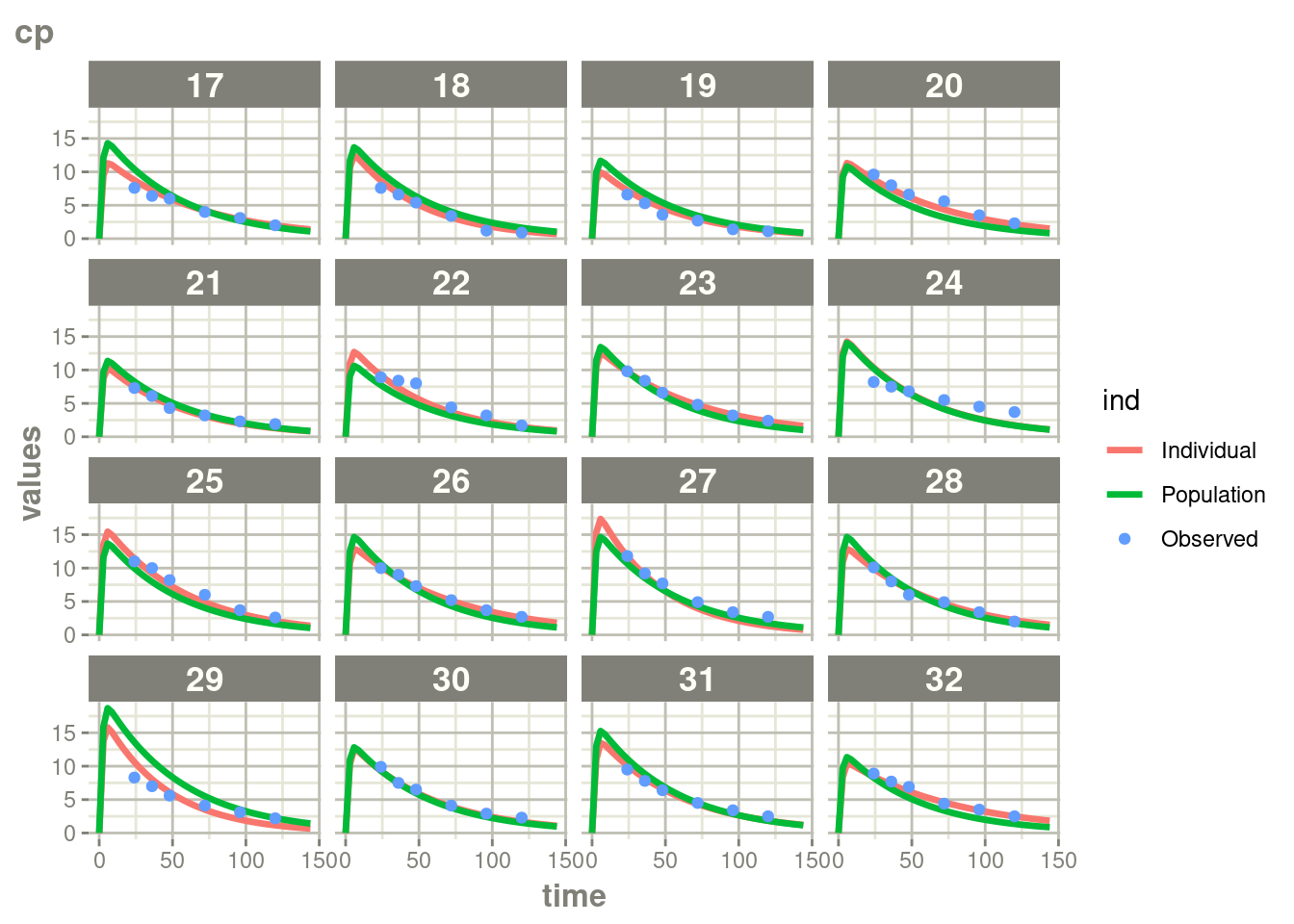
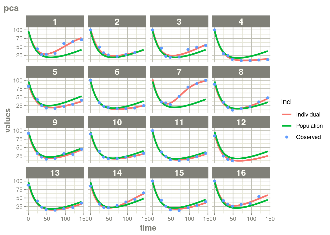
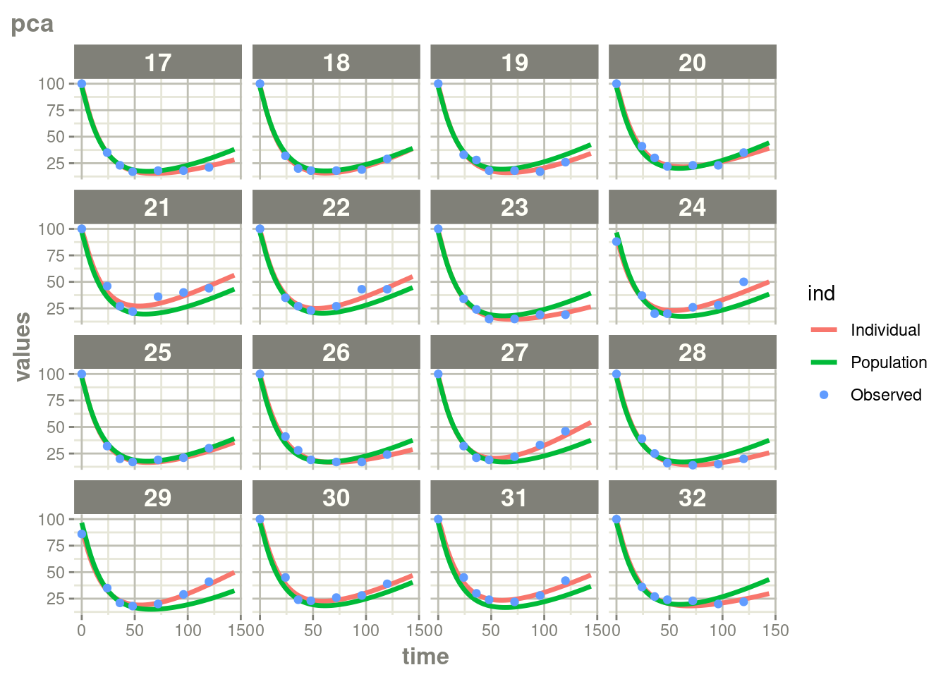
In this case, where there is more rich data, the differences are a bit
less drastic than the phenobarbitol example, but still more full
profiles are present for patients who discontinued when using augPred()
Also, as a note, the plots made inside nlmixr2 are subset by
endpoints and can be subset to which-ever plot that you wish to have.
Perhaps someday easier method (with say filter()) can be used to
select the correct plots.
Overall, augPred() is an easy and useful way to add more complete predictions to any
model.